
It’s about comprehension.
We’re always speaking to teachers so that we can understand where we can help. One gap we identified is a lack of materials that support students as they learn to understand charts and graphs. So, we got to work!
Think about it – How many hours of screen time do kids get each day? Where are we located on a map? How many 5 star reviews did a product or service receive? What’s the weather forecast?
Not to mention that most professions require interpreting data in one way or another. Medical fields look at data trends to help treat patients. Businesses make forecasts based on historical performance to increase revenue. Retail decides what inventory is needed to make a profit. And teachers use data to inform instruction and track their student’s progress.
Interpreting data: starting with the basics
It starts out at a very basic level – with charts and graphs.
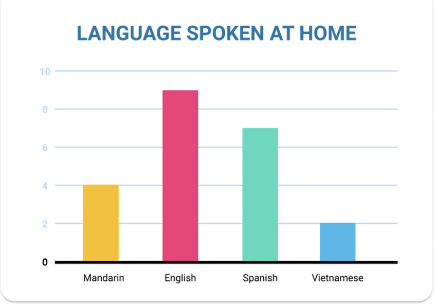
Let’s look at the bar graph above as an example. In the primary grades, there is a lot of “point and drag” when looking at graphs. When we ask students to tell us how many people speak Spanish the student points to the word Spanish and then drags their finger up to the top and then over to the side to see the number “8”. This is the start of identifying the information in a graph.
Identify first then interpret and understand
In the secondary grades we transition from identifying information in graphs to understanding and interpreting what information the graph is conveying. Instead of asking how many people speak Spanish, the questions focus more on the meaning behind the graph.
For example:
- Would this graph represent homes in a New York City neighborhood or a suburb of Philadelphia? This causes the students to think about which place would have more diverse families.
- If I am a Vietnamese speaking family, would I find my community here? This asks the reader to analyze a demographic.
- Which statement can be supported by the graph? Various statements are given about the relationship between the bars.
As students progress through school, they need to be able to understand more complicated charts and graphs using them to influence decisions. This is a skill that’s used almost daily!
From “point and drag” to “understand and interpret”
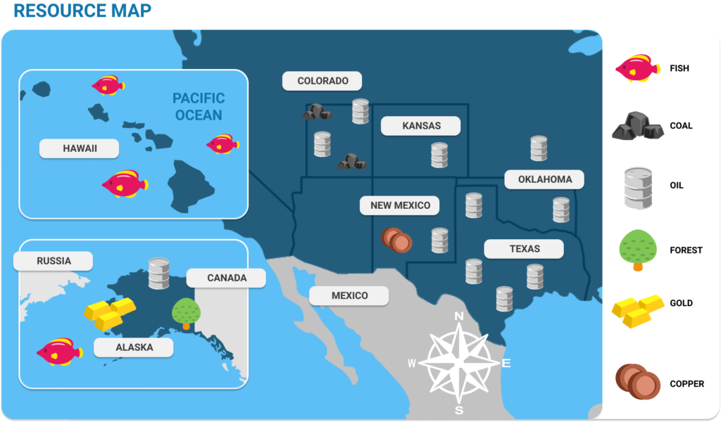
The primary grades are all about “pointing and dragging” when looking at graphs. Let’s look at the chart above as another example.
When we ask students to identify what resource is in Kansas the student points to the word Kansas and then drags their finger over to the key to see that oil is the main resource. This is the beginning of how to identify the information in a graph.
Secondary grades start the transition from identifying information in graphs to understanding and interpreting what the graph is trying to convey. Instead of asking which resource is in Kansas, the questions would focus more on the meaning behind the graph.
- Which state has an abundance of oil? This causes the students to think about the word “abundance” then looking at the graph to see which state has the most.
- If I have a fishing business, which location would be best for my business and which would be the most challenging? This asks the reader to analyze the difference between the land and sea resources. They can see where the fish icons are, as well as, make connections to why they are there.
- Which statement can be supported by the graph? Various statements are given about the relationship between the location and the icons.
Interpretation in daily decision making
Let’s apply it to real life! What charts and graphs do you look at daily that determine decisions? Here are a few examples:
Maps App – We use our GPS all the time to make sure we are on the fastest route to the destination. Sometimes, there is an alternate route that you can select. This is where you interpret! Do you stay the course that might be faster but you have to sit through traffic OR do you take the slightly longer route? Looking at the map, you take all of the information before making a decision.
Weather Forecast – Whether going to school or work (or even your home office), the weather can determine your attire. If it’s going to be chilly in the morning and warm up in the afternoon, you want to dress in layers to be comfortable. This choice is made by looking at the two extremes that this chart has to offer.
Food Label – The food label will tell you the breakdown of what you are eating. If you are watching out for a food allergy or are simply trying to cut back on sugar, the label helps you make that decision.
In the Classroom
Introducing your students to various charts and graphs questions types puts their inferencing skills to the test and helps them make informed decisions. With over 500 (yup!) questions and passages we’ve got your students covered as they start inferring, synthesizing, summarizing, close reading, and discerning purpose to navigate our data driven world.
This blog covers just a very small sampling of the full suite of charts & graphs resources that educators and students can find in Dreamscape (and in our resource hub). We offer multiple, original charts and graph assignments for students in grades 3 – 8 to help them become familiar with various types of charts and graphs, along with different question types to support their understanding.
Log in to assign a charts and graphs assignment to your class or create your free account to get started.